|
This article is a summary of Trang’s presentation at
the Technology Showcase, TESOL CALL-IS in Seattle, Washington, USA in
March 2017. She is very grateful for the English Access Microscholarship
Program, the U.S. Department of State for sponsoring her presentation
and attendance at the 2017 TESOL convention.
Though you can see teaching standardized tests as
one-way interaction and boring, you can utilize different
technology-based tools to maximize the effects of presentations and
enliven lessons. This article on the use of
Microsoft PowerPoint in interpreting graphs is drawn from my own
experience teaching English for standardized tests for 5 years. In
teaching contexts such as Vietnam, classes are rarely equipped with
interactive white boards, which allow users to draw directly on the
board using electronic pens. Instead, in some English centres in
Vietnam, a laptop is connected to a smart TV, which can be used to show
Microsoft PowerPoint slides. In these places, the use of Microsoft
PowerPoint has been considered crucial for teachers of English to
guarantee an efficient lesson in which students can discuss significant
features and trends of a certain chart and teachers can elicit ideas
from students and give instructions on vocabulary and grammar in a
timely manner.
Among well-known English standardized tests,
Writing Task 1 of the International English Language Testing System
(IELTS) test measures students’ ability to describe charts and graphs.
This ability is well illustrated with the use of Microsoft PowerPoint
because PowerPoint exposes students to different kinds of visual charts
and graphs. With PowerPoint, you can ask students to work individually,
in pairs, or in groups to discuss the most significant features of a
chart. Furthermore, both teachers and students can make their
interpretation visual by using the program’s pen and highlighter
functions.
Most important, after the lesson, you can email
students the PowerPoint slides along with words for interpretation so
that students are able to review what they have learnt. PowerPoint lends
itself to scaffolding students when describing charts and graphs in a
standardized test preparation class. PowerPoint features such as
animations, layout, Shapes, SmartArt, Chart, and annotations can be used
to introduce concepts of trends and levels and speeds of changes, spark
discussion, elicit ideas, and revise learnt phrases. Following are some
practices that show the use of PowerPoint in teaching
graphs.
Practice 1: Introduce Concepts (Degree of Change, Speed of Change)
Teachers can introduce degrees of change, such as increase,
decrease, leveling off (in both verb and noun form), and the speed of
change (adjectives and adverbs; see Figure 1).
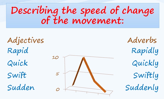
Figure 1. Describing the speed of change of the movement.
Practice 2: Elicit Main Trends, Special Features of the Graphs and the Charts
Teachers can draw or point to show the connections between various categories (see Figure 2).
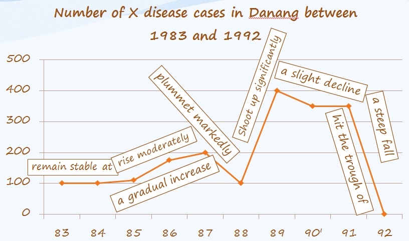
Figure 2. Elicit Main Trends of a Line Graph
Practice 3: Scaffold Students
Scaffold students with visual and engaging activities: match
descriptions with appropriate graphs, highlight formal words and
structures, gap-fill, read descriptions and draw, compare formal and
informal writing styles. For example:
-
Comparing different writing styles: Have
students find similar phrases in two different styles and then point out
features of formal and informal writing styles (see Figure
3).
-
Correct mistakes: Elicit students’ answers
on the topic (e.g. what, when, how) and the main trend of the given
figure. Then, have students find out the incorrect information in the
given text that interprets the figure. The incorrect information can be
either underlined or circled before the suggested answer appears. If
needed, elicit the differences between incorrect and correct options.
(see Figure 4).
-
Gap-Fill Exercise: Elicit students’
answers on the topic (e.g. what, when, how) and the main trend of the
given figure. Then, have students read the text that interprets the
figure and predict the kind of information that can be put into the
gaps. This activity can particularly draw students’ attention to the
various sentence structures and wording that students can employ in
describing graphs and charts, for example, the comparison starting with
an adjective (greatest); the summary word (this lead); the vocabulary
for prediction (was estimated, was likely to, would continue); the
preposition (with + a noun phrase; increase + in) (see Figure 5).
-
Describe proportions: Have students list
all possible ways to mention a certain number, e.g. 90%, 75%, 67%, 49%,
26%, 2%. This is a visual way to lead students to think of how
proportions are well illustrated in different forms, which, in turn,
encourages students to diversify their descriptions of proportions. The
number ‘75%’, for example, can be replaced with ‘the majority of, a
hefty 75%, three out of four, three quarters, three in four’. 10% can be
altered with ‘a minority of, a mere 10%, an insignificant 10%, one in
ten, one out of ten’. (see Figure 6)
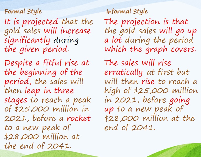
Figure 3. Comparing different writing styles.
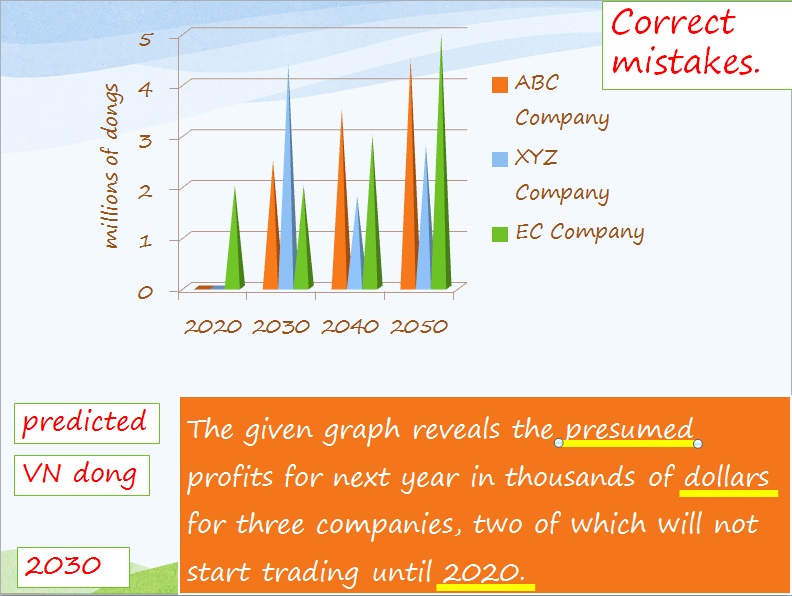
Figure 4. Correcting mistakes.

Figure 5. Gap-fill exercise.
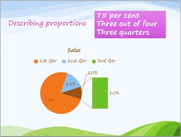
Figure 6. Describing proportions.
Practical Implications
Any introduction of new words and trends should take into
account students’ proficiency. You ask students to work in pairs or
groups to list all nouns and verbs for a certain trend. Then, introduce a
few more words or elicit the equivalent verb and noun. Do not overload
students, especially low-level students with a list of new words.
Students are supposed to write sentences or phrases down. Also, you
should tell students to note down important phrases because they may not
be aware of good phrases and structures that they should use in their
interpretation of graphs and charts.
Checklist for Using Microsoft PowerPoint in Interpreting Graphs and Charts
- ____ Lends itself to visual learning style
- ____ Students are able to retain language
and structure features of the chart along with main trends, noticeable
comparison of the chart.
- ____ Saves teacher’s time giving instructions and writing on board
- ____ Student self-study
- ____ Adds audio explanations that go with the slide à Tutorial purposes
Le Trang is a lecturer of English at Vietnam-UK Institute for
Research and Executive Education, Danang, Vietnam. Her research
interests lie in teaching pedagogy, language testing, writing, and
computer-assisted language learning. |